
WordPress Mobile App Redesign
Redesigning and simplifying the user flow for the creation and management of new content.
- Product Designer
- Preliminary Research
- UX Audit
- UX/UI
Project Overview
After a UX audit and years of experience with the WordPress mobile app, I found some issues in the user flow for creating and managing new content.
Creating new posts (or pages) is the main task for users with the mobile app. Adding new content on the go, while commuting, on vacation or elsewhere. This flow should be as seamless as possible, giving them the possibility to add new engaging posts as easily as they can craft a note on their devices.
The Problem
- Cluttered interface with too many options competing for attention.
- Important actions (like publishing or previewing a post) are buried.
- Limited visual hierarchy, making it hard for diverse users to navigate quickly.
Goal: Simplify the mobile content creation experience while maintaining visual clarity and accessibility.
The Solution
To tackle this challenge, I did some competitor research to gain some insights into the needs and preferences of the target audience, assuming other platforms such as Medium or Substack had conducted user tests to deliver the best possible UI. Due to a lack of resources I based this on assumptions and UI conventions instead of the desired user research.
On top of that, I took to other apps like Notion, Google Keep, Apple Notes and Obsidian to make sure the best practices and common patterns were intact, ensuring a user friendly environment. Users can now create and manage content faster and more intuitively. This is a mobile-first design that ensures accessibility for diverse user groups.
Process
Research and insights
Competitive Analysis:
- Reviewed WordPress and competitors (Medium, Tumblr, Blogger) to understand mobile content workflows.
- Competitors prioritize key actions on the home screen, while WordPress buries them behind multiple taps.nt actions (like publishing or previewing a post) are buried.
Pain Points:
- Multiple steps to start a post or access formatting tools.
- Important buttons like “Publish” are not prominent.
- Low visual hierarchy increases cognitive load.
User Insight:
- Users create content in short bursts and need speed, clarity, and intuitive control.
- Streamlined workflows with clear hierarchy and contextual actions reduce friction and improve accessibility.
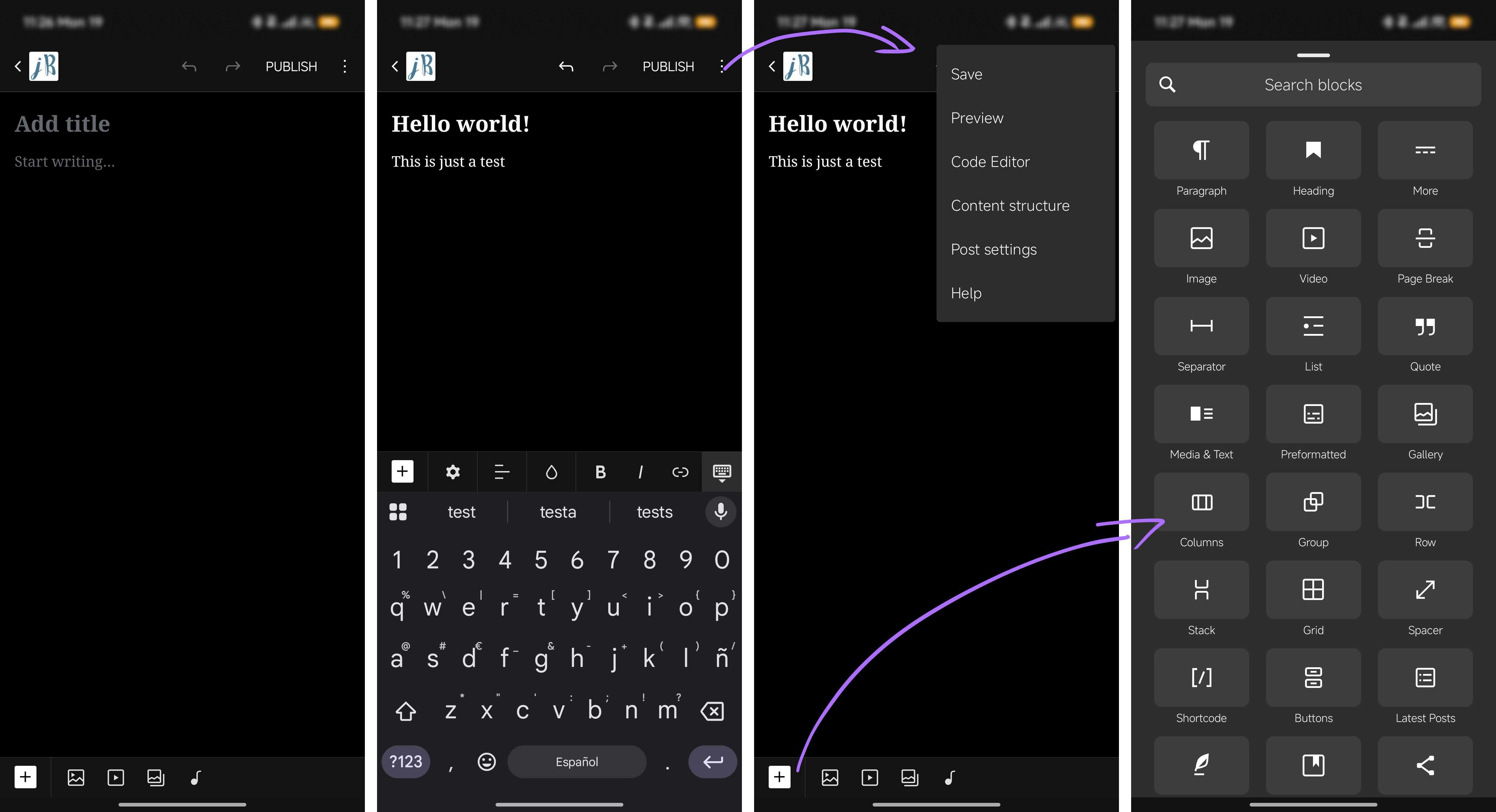
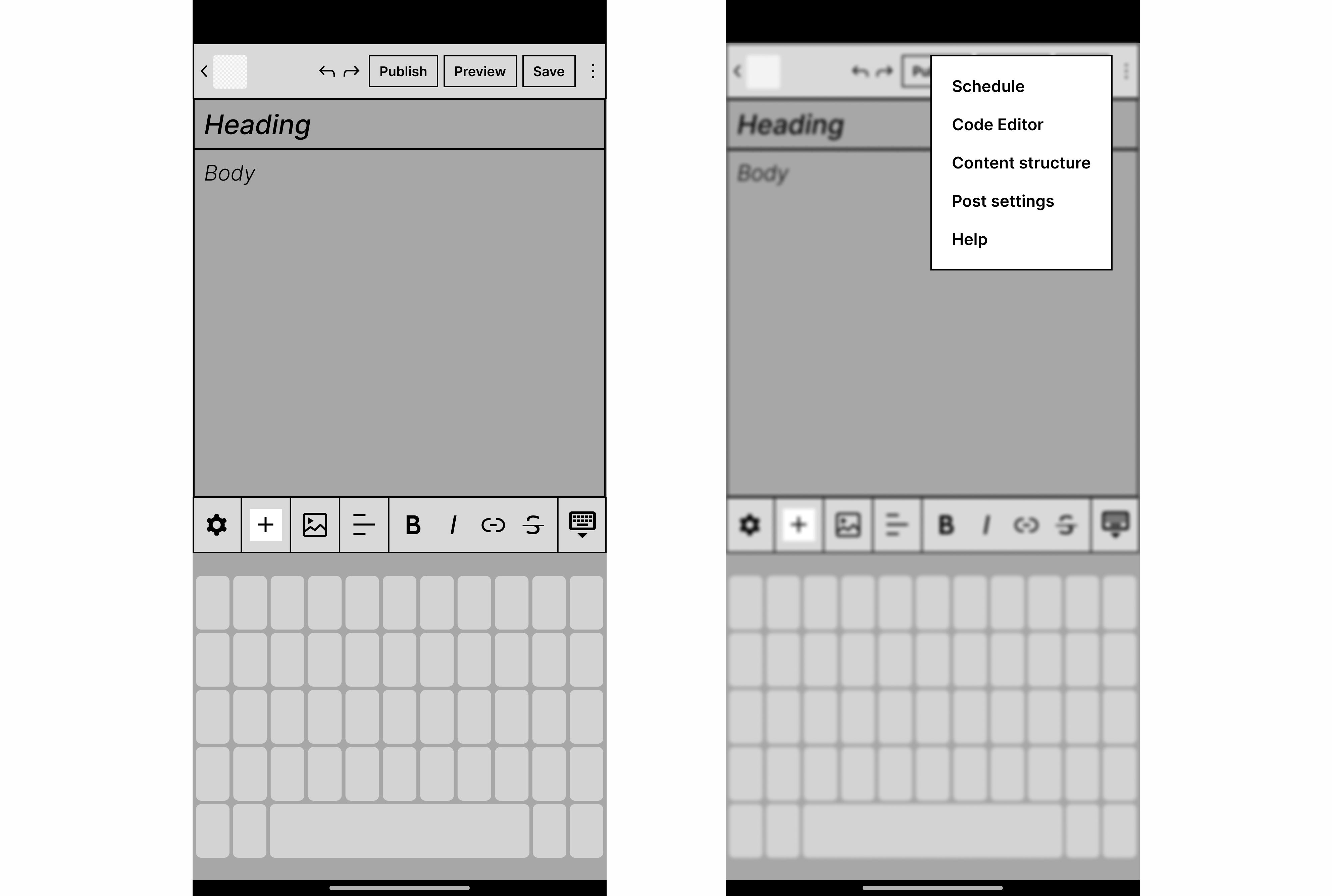
Sketching and Wireframes
As part of the iterative design process, I explored 2–3 layout options prioritizing clarity and fast content creation. Trying to focus on a minimal navigation, clear actions and quick formatting.
For the navigation I opted for a top navigation, keeping it minimal but straight to the point, with the main elements users need. Having as well clear primary actions always at hand, such as publish, preview or save.
Another point that I want to highlight is the need for clear and simple media and formatting tools.
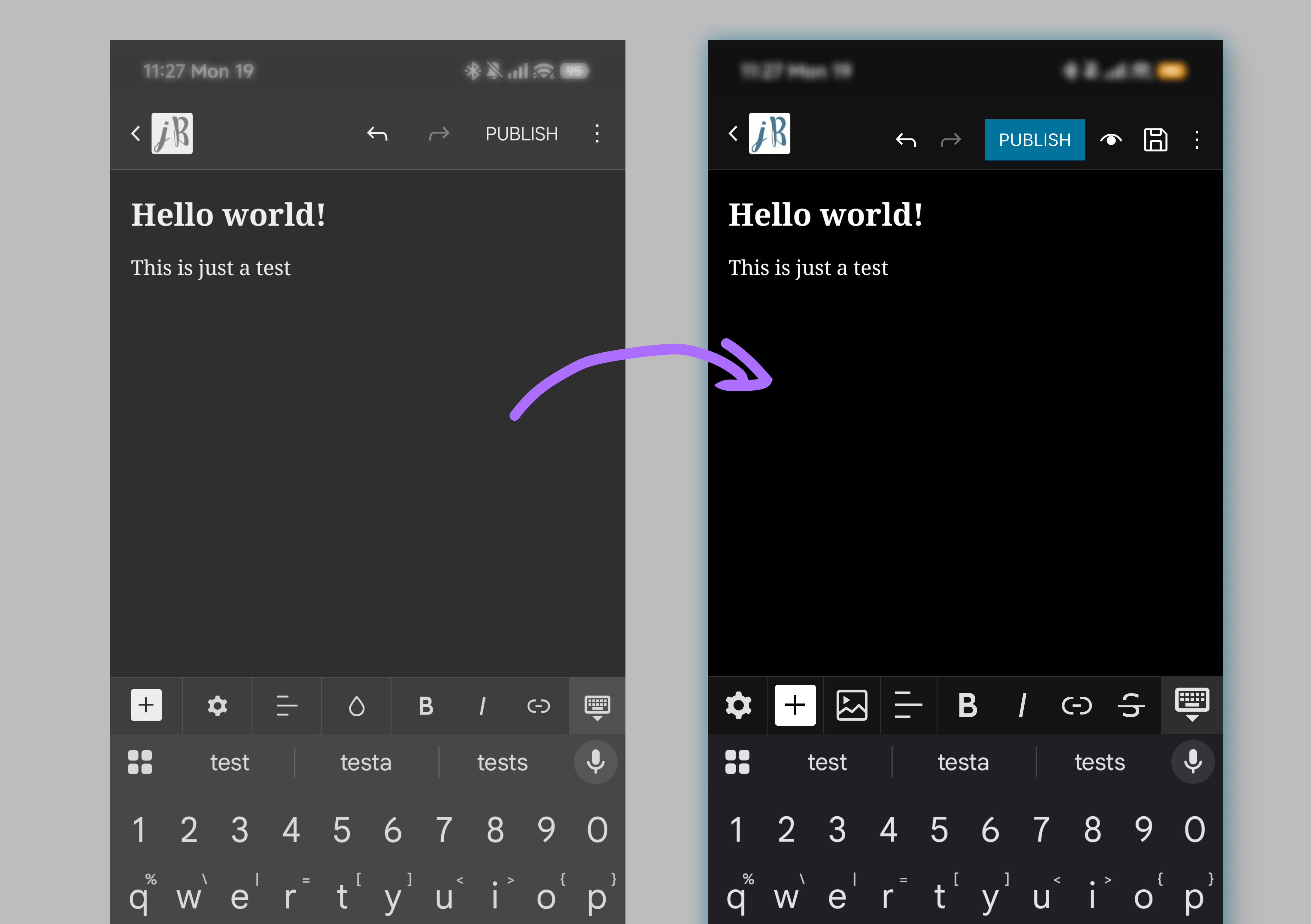
High-Fidelity UI
For the end result, a high-fidelity UI, I applied WordPress brand style (colors, typography, etc) and improved hierarchy. Making primary actions more prominent and secondary actions accessible but a bit more subtle. This UI ensures accessibility, with high contrast, readable font sizes and intuitive touch targets.
.png)
Results
After some iteration I designed a new content creation screen. More streamlined, giving users more control over their post creation! With improvements in visual hierarchy, simplicity, and user-friendly touch targets.
- Home dashboard / “Create New Post” screen
- Post editing screen with redesigned toolbar
- New preview, save, publish or schedule flow

