
Metro Madrid App
This UX redesign is meant to improve the usability of the official Metro app to help turn it into commuters’ first choice instead of their current ones.
This redesign includes new features and a completely revamped navigation service.
My role in this project: User research and UX redesign of Metro Madrid App.

Making 'Metro' commuters' first option
The Challenge
Metro Madrid has an outdated app. Users –according to research– refuse to navigate through the official app and prefer to rely mostly on Google Maps and Citymapper instead.
UX research points out some major flaws to address, such as tiny buttons, lack of maps, among other things.
The Solution
A full research –interviewing users and collecting data– and creation of a User Persona to design the optimal experience, would be a first step, continuing with revamping the UI, simplifying elements and adding some new features.

Preliminary research
By observing both Apple’s App Store and Google’s Play Store statistics, we can see users prefer to download and trust different apps such as Citymapper, Google Maps and others.
I conducted interviews to see what were the users’ thoughts on the current Metro app. Most think it lacks information about the city and some of the functionality other apps have. They want a quicker way to see what the different paths are, what possible commuting options are available. The app lacks a proper map to help the user get around the city. Based on the entire background research, I created a user persona that constitutes a representation of most potential users.
On top of the many features that can be found in competitors’ apps, the Metro app has an outdated look that feels quite old compared to Citymapper. I took this change to make it clutter-free, breaking it to pieces and leaving just the top features users truly needed, then piecing it all back together while adding some other new features.
User Persona

Creating the new Metro App
Wireframe and user flows

Commute with ease


Promising results
Users are now able to go through the app to check for more useful information following different yet equally efficient paths in their task solving journey.
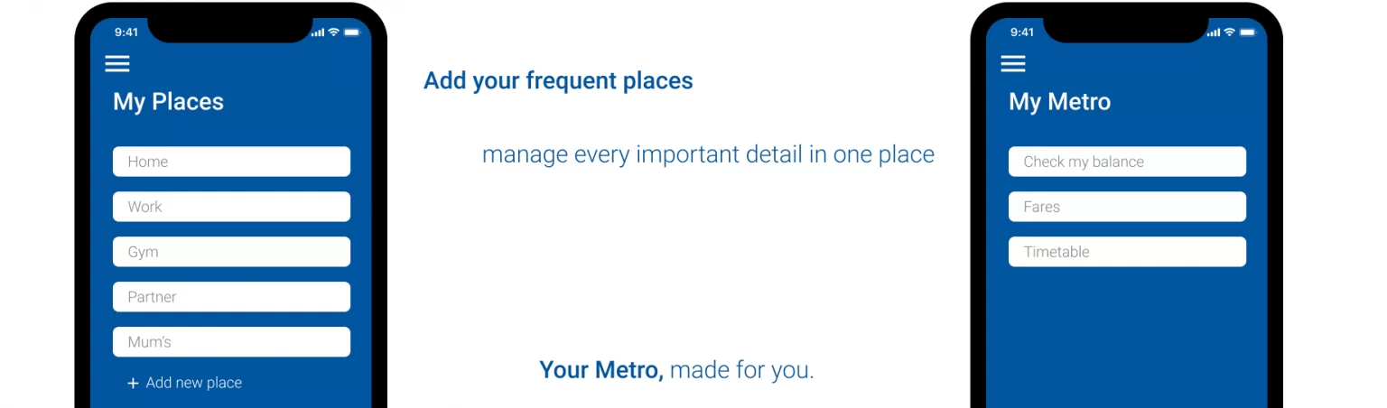
New features include a more usable interface (including map integration), tourism information, “Next stop” notifications, and important security features to guarantee the safety of all users. User interviews show that new features such as “My places” or “Saved stops/stations”, help improve users’ experience with the app while also helping them meet their needs.
More value, same ease


